Role:
Concept
Art Direction
UI Design
Agency:
monopo
Role: Concept, Art Direction, UI Design
Agency: monopo
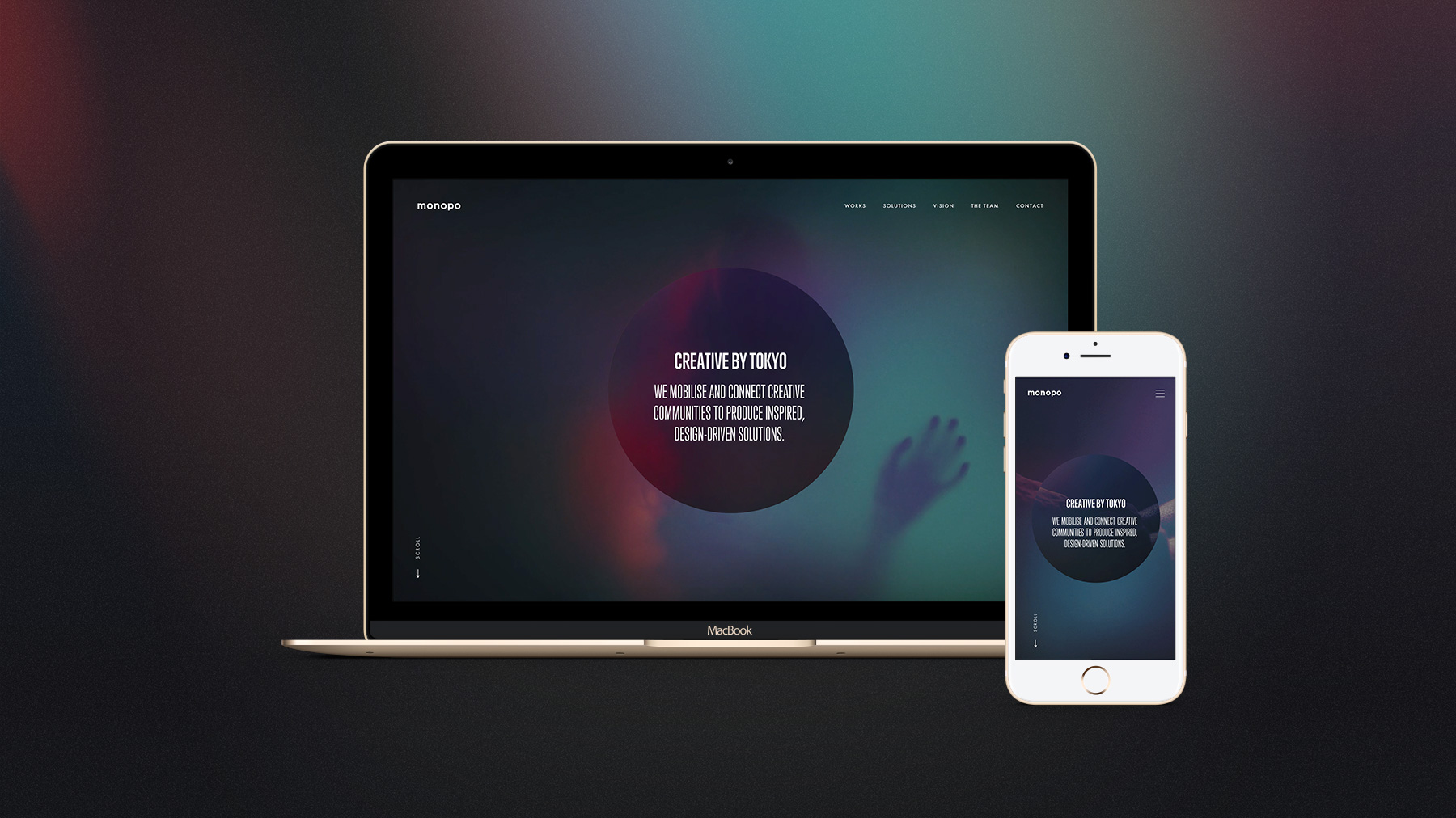
For an agency, a portfolio is a powerful calling card. In 2017, I redesigned the portfolio of monopo, the Japanese creative agency which I'm currently running in London. The challenge was to create a portfolio that respects the Japanese roots but attracts people from all over the world.
For an agency, a portfolio is a powerful calling card. In 2017, I redesigned the portfolio of monopo, the Japanese creative agency which I'm currently running in London. The challenge was to create a portfolio that respects the Japanese roots but attracts people from all over the world.
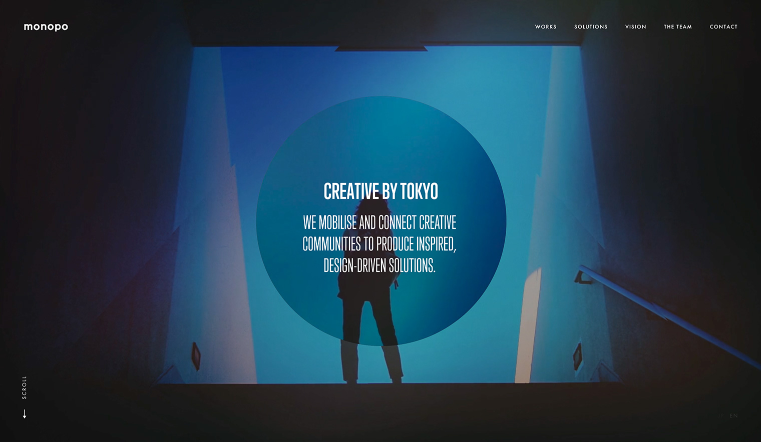
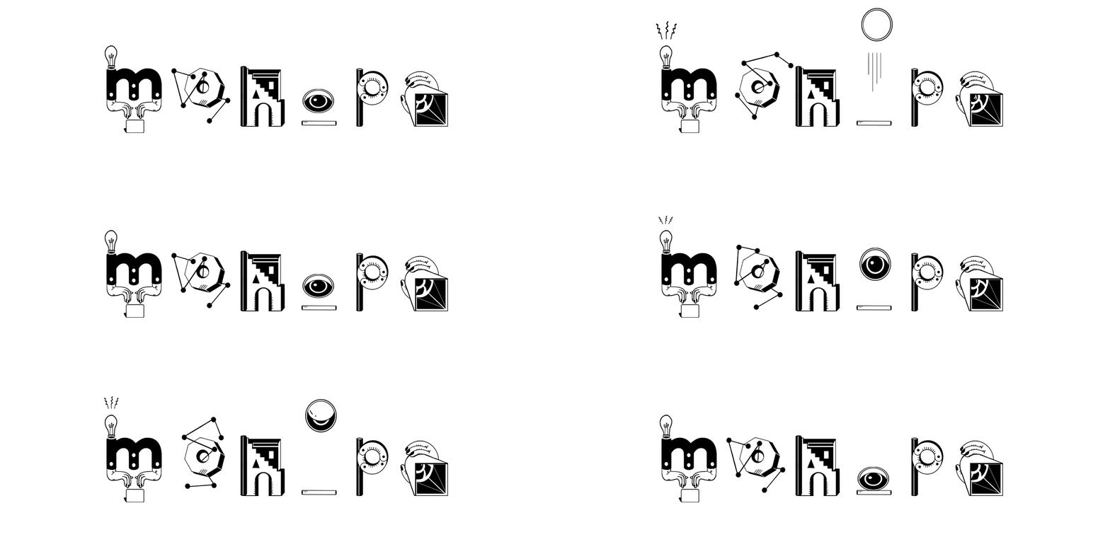
monopo's name is composed of many circles included in 3 "o" and "p".
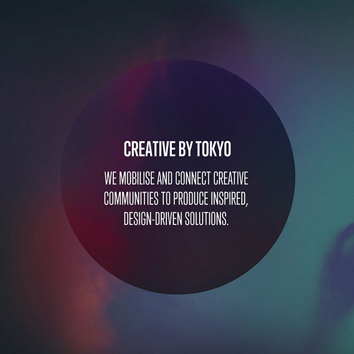
I decided to embrace this to make it our symbol and the center of our website's concept to trigger our creativity. The website is navigating around this centered circle, which always stays fixed and is used for different UI purposes creatively: scrolling, timeline, box for filters, loading bar, visual effects...
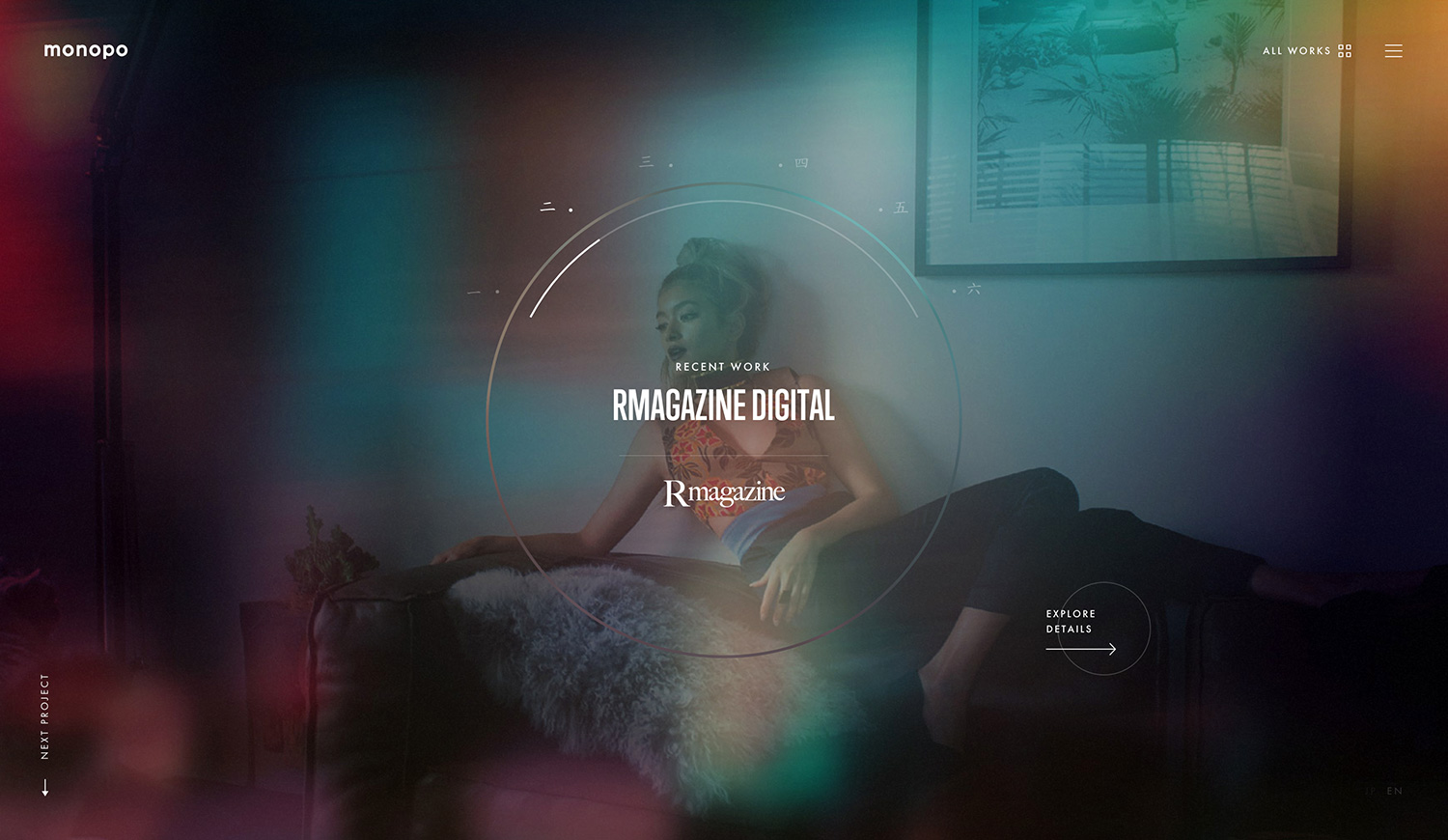
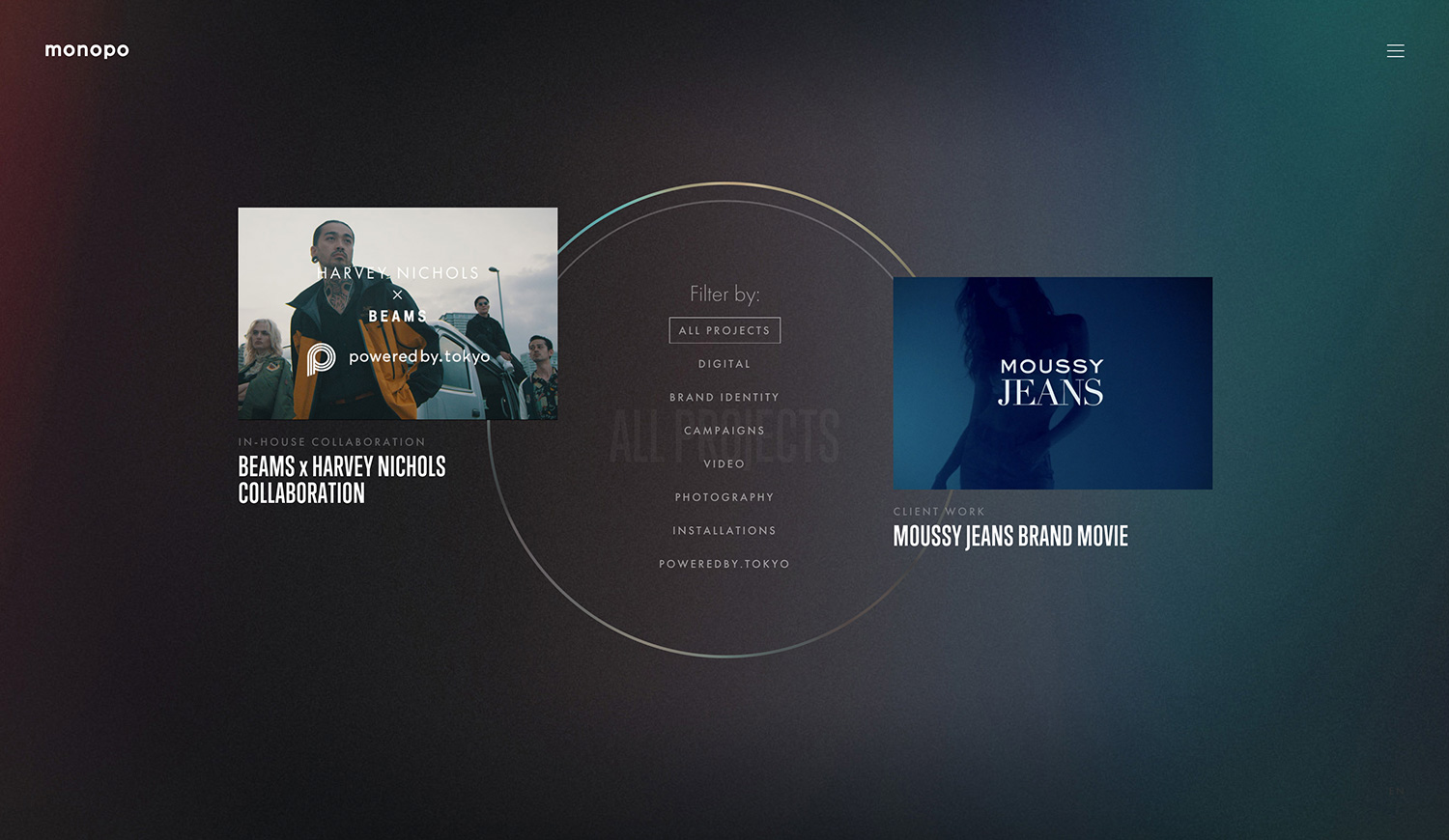
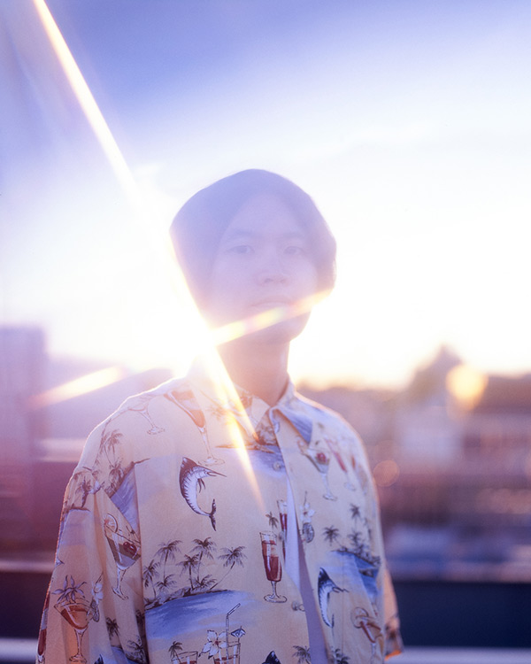
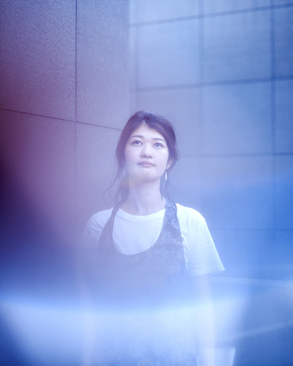
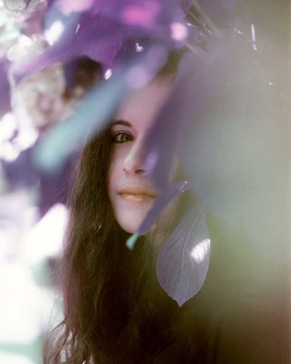
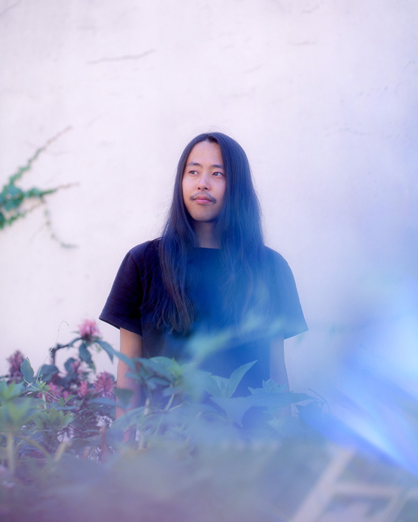
Our goal was to communicate that we are a Tokyo-based agency and conveying the feeling of Tokyo visually. One of my main inspirations was the night lights of Tokyo. Light leak effects and gradients of colors resulting from Tokyo night pictures became the center of the identity of the website.
Those light-gradients also convey the feeling of softness and nuance, felt in Japanese culture and in monopo's personality. They represent the fluidity of our creative process, what happens when all those perspectives come together and the mystery of what the result might be.
Our goal was to communicate that we are a Tokyo-based agency and giving this feeling of Tokyo visually. One of my main inspiration was the night lights of Tokyo. Light leak effects and gradients of colors resulting from Tokyo night pictures became the center of the identity of the website.
Those light-gradients also convey the feeling of softness and nuance, felt in Japanese culture and in monopo's personality. They represent the fluidity of our creative process, what happens when all those perspectives come together and the mystery of what the result might be.
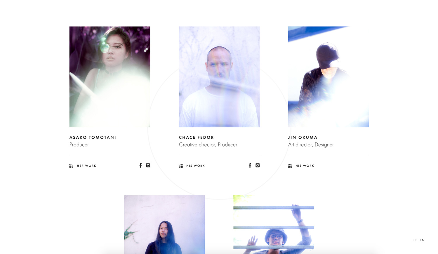
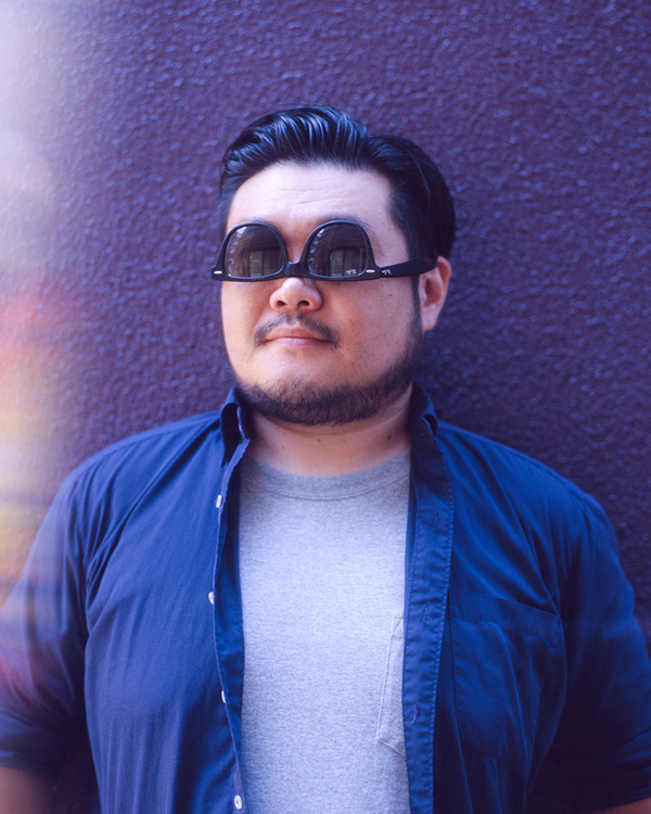
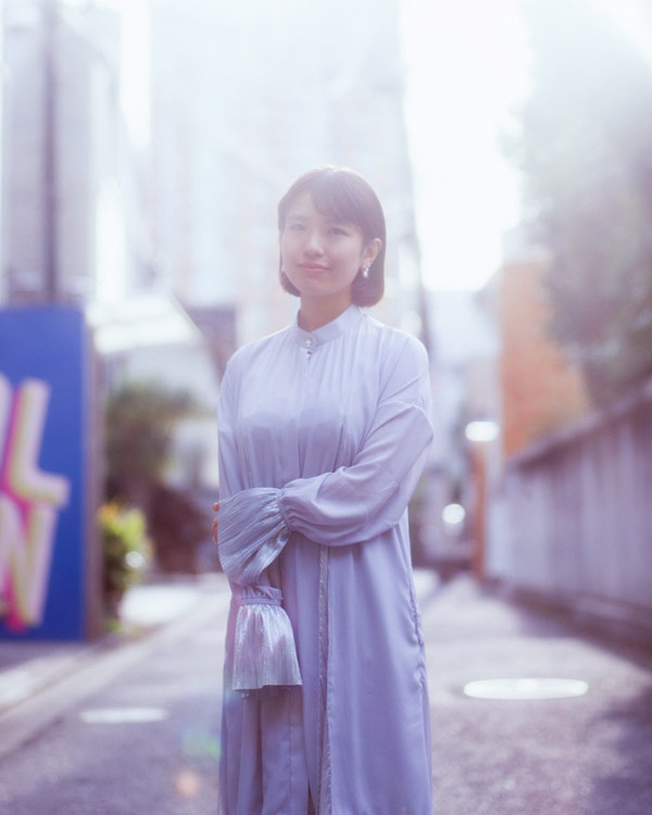
This feeling of softness and the beauty of playing with light reflections led us to working with photographer Gui Martinez to make our team portraits.
This feeling of softness and the beauty of playing with light reflections led us to working with photographer Gui Martinez to make our team portraits.
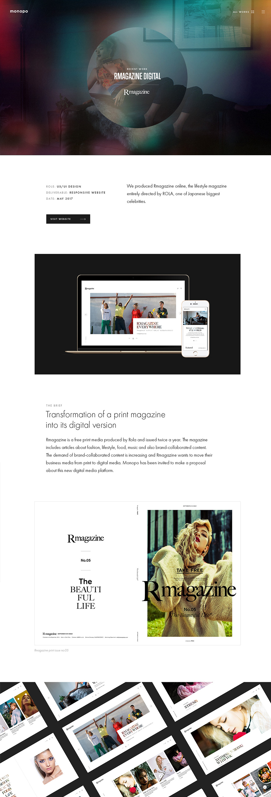
For the inside pages of the website, I developped more editorial layouts and a system to create detailed case-studies to show our thinking and the variety of our services.
For the inside pages of the website, I developped more editorial layouts and a system to create detailed case-studies to show our thinking and the variety of our services.
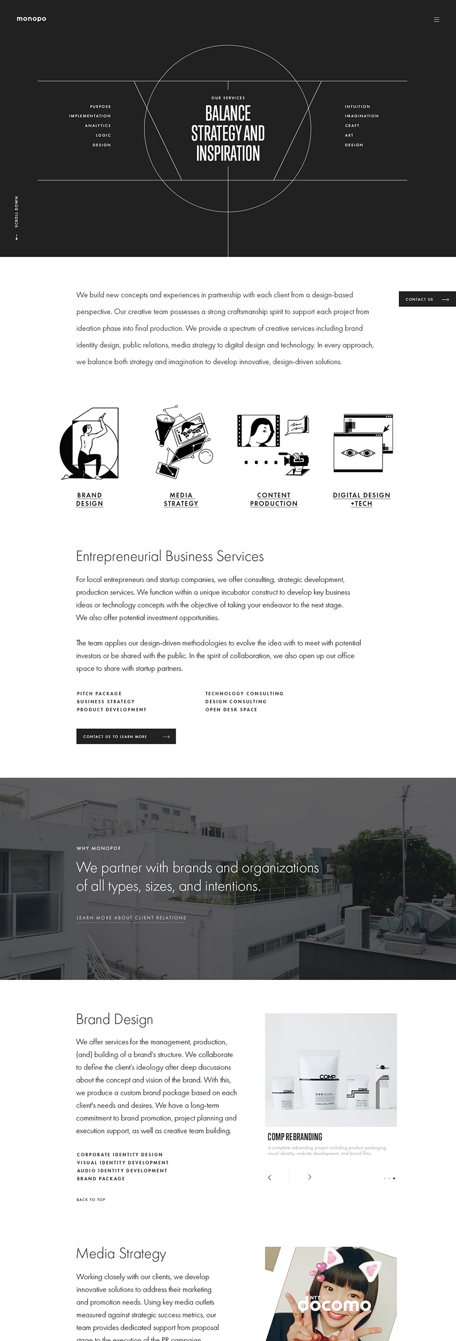
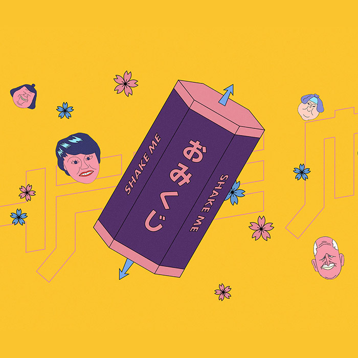
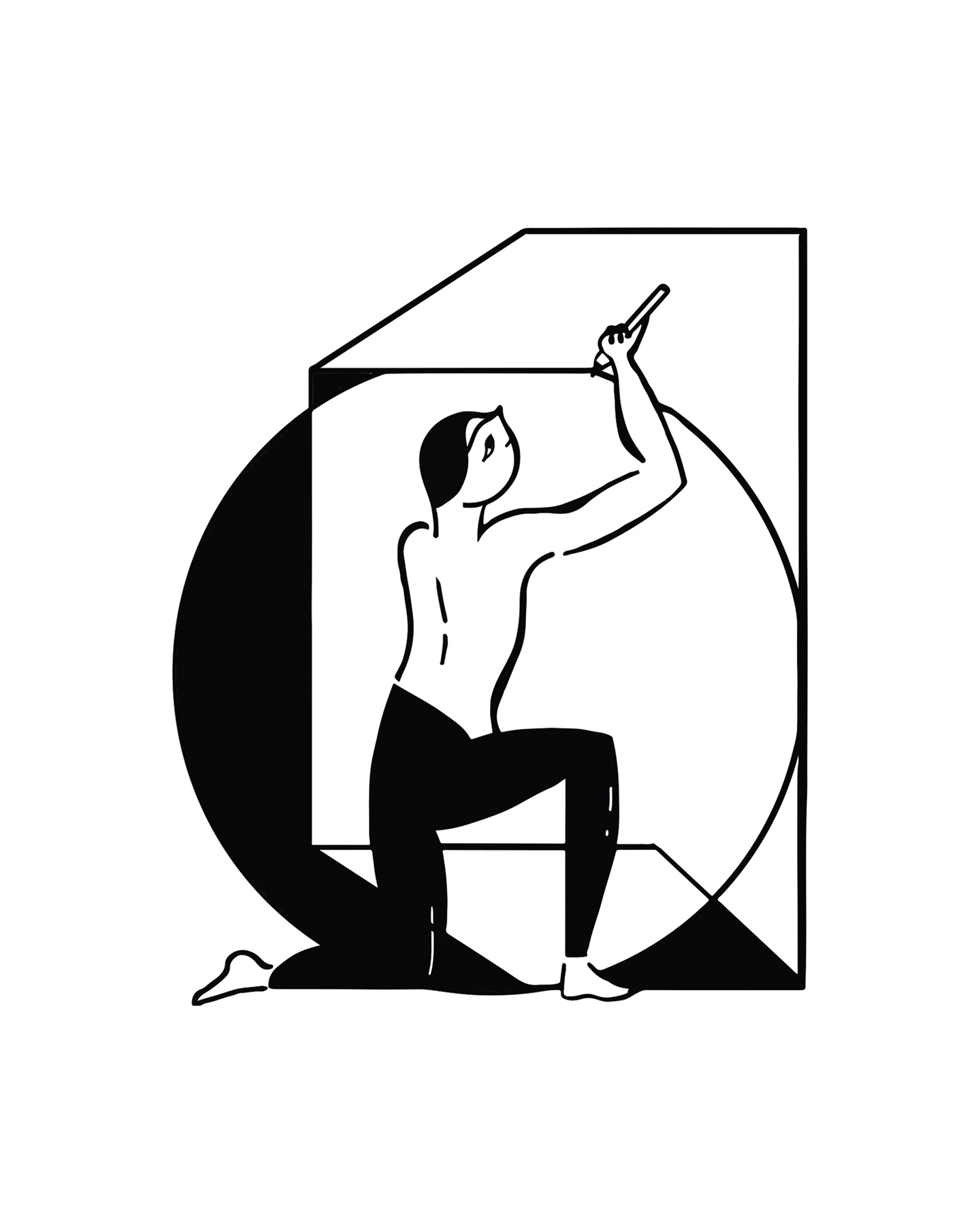
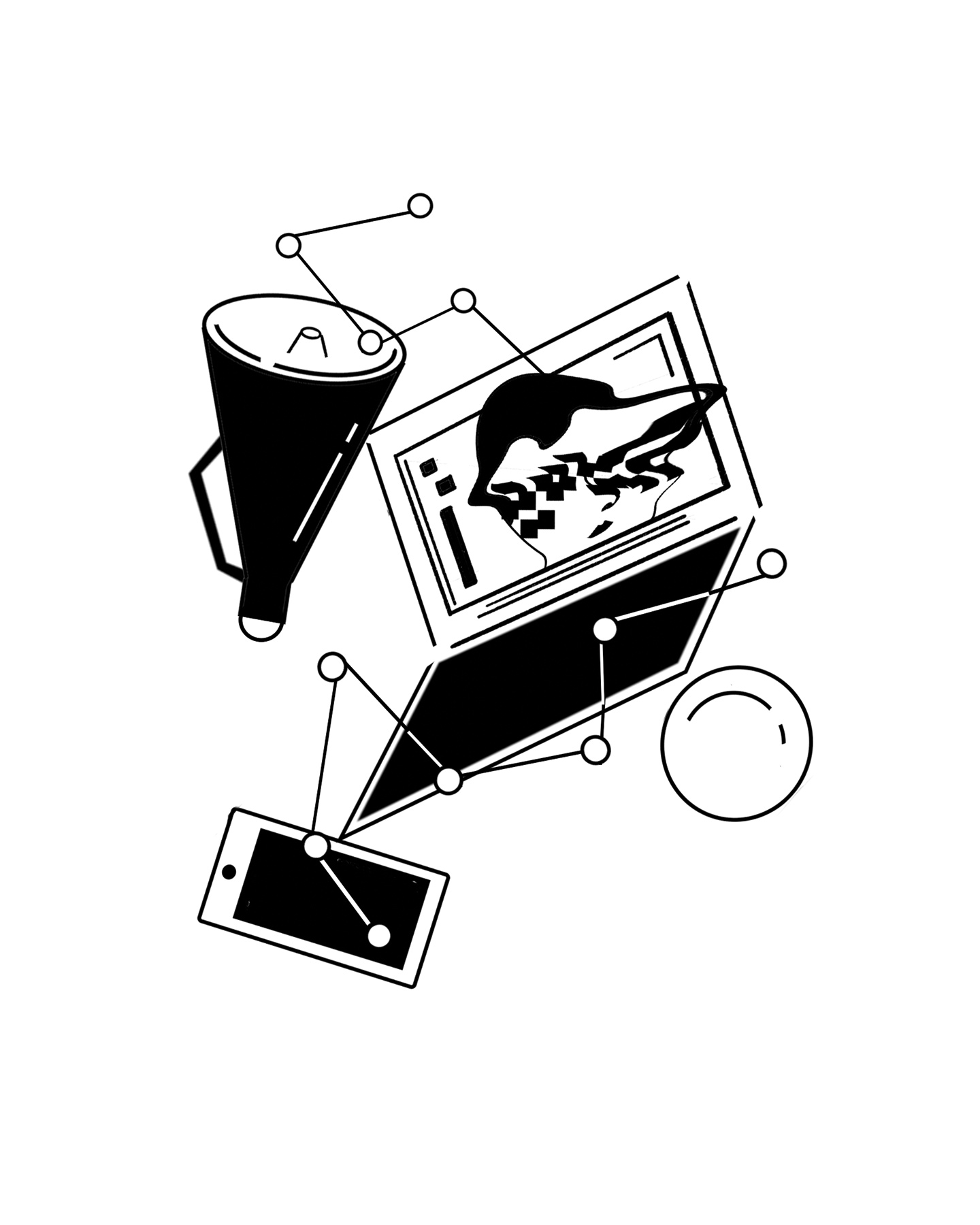
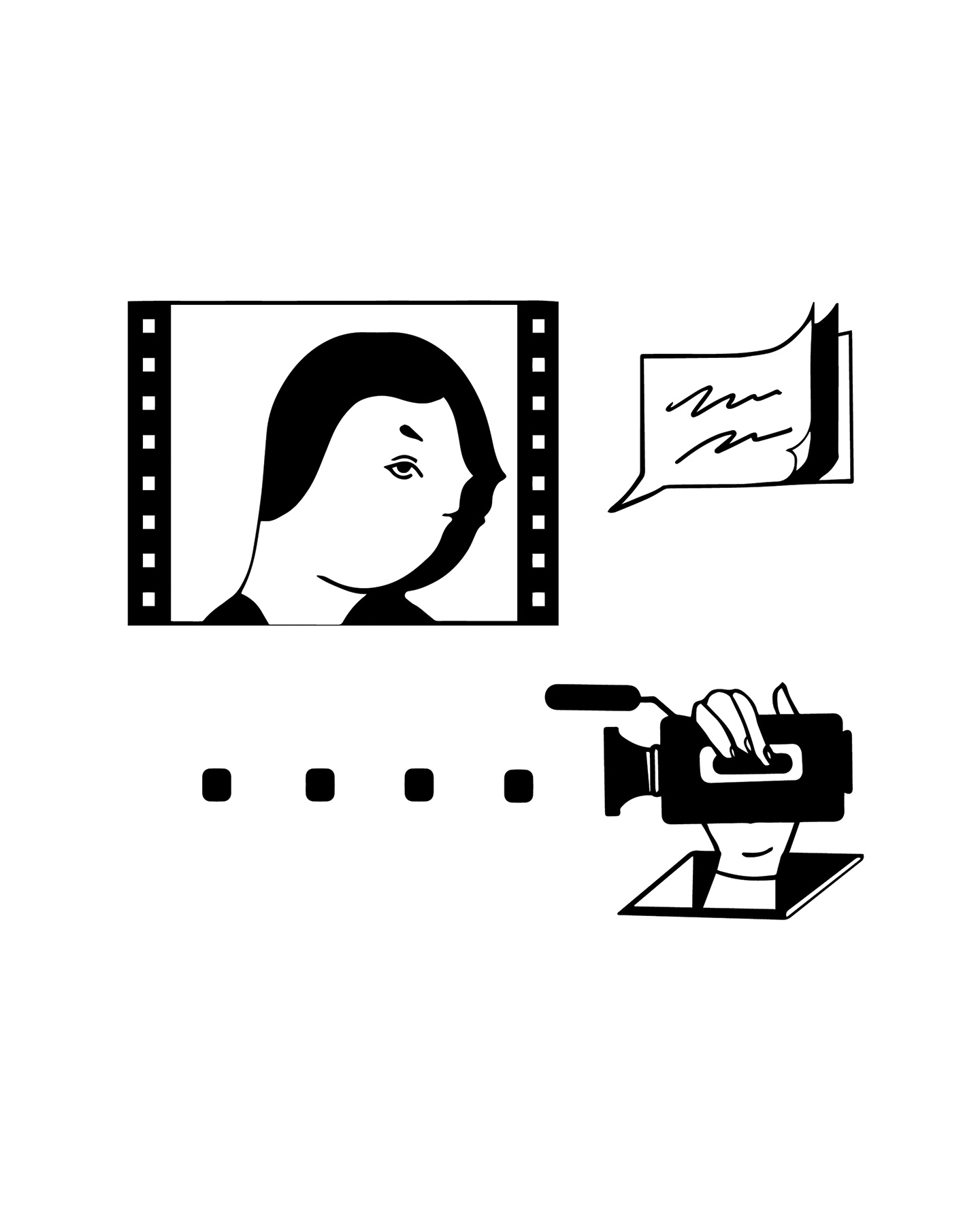
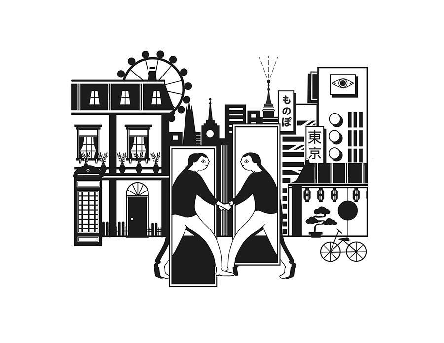
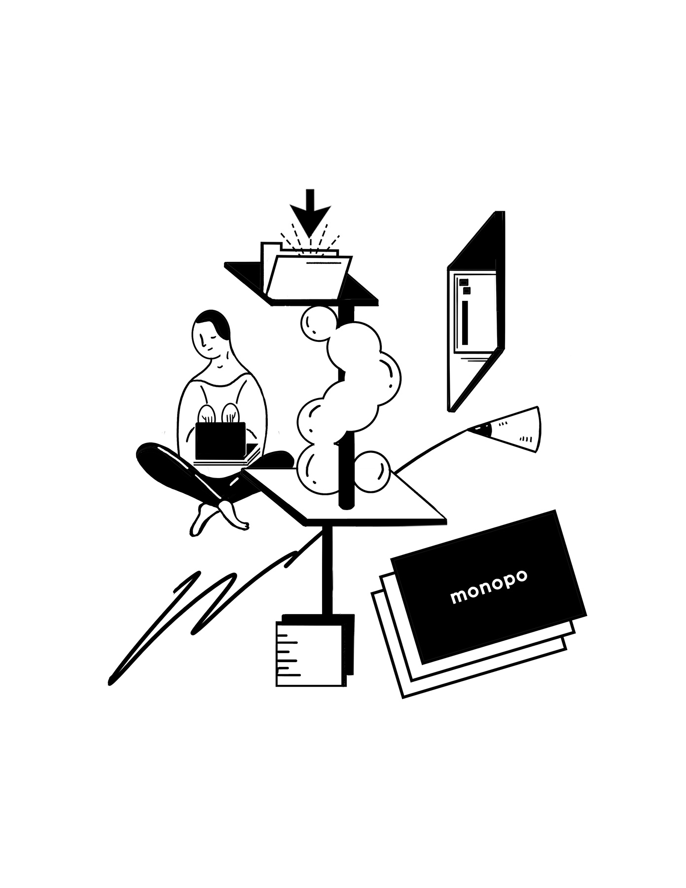
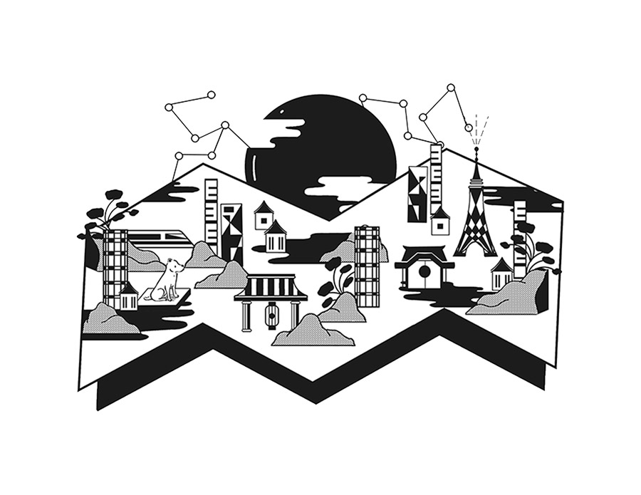
I also worked with our in-house illustrator Mei Kanamoto to create a series of new branded illustrations to represent our services and culture.
I also worked with our in-house illustrator Mei Kanamoto to create a series of new branded illustrations to represent our services and culture.
Credits
Credits
Producer: Yoshiyuki Sasaki
Art direction: Mélanie Hubert-Crozet
UI Design: Mélanie Hubert-Crozet, Lessa Chung
Front-end developer: Ryo Miyakawa
Back-end developer: Kenta Takahashi
Technical director: Shun Okada
Illustrations: Mei Kanamoto
Introduction video: Artem Skyi
Portrait photography: Gui Martinez
Agency photography: Nik van der Giesen
Other projects

Yonex Golf - Ezone GTAdvertising campaign

Canada Goose - Lighweight DownSocial campaign
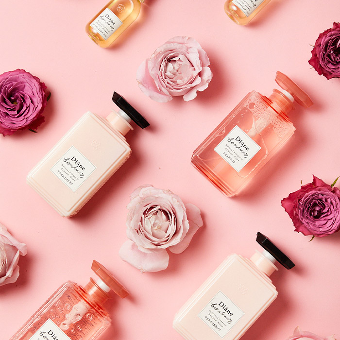
Diane BonheurSocial Content


