Role:
Creative Direction
Art Direction
Design
Client:
Canada Goose
Agency:
monopo
Role: Creative Direction, Art Direction, Design
Client: Canada Goose
Agency: monopo
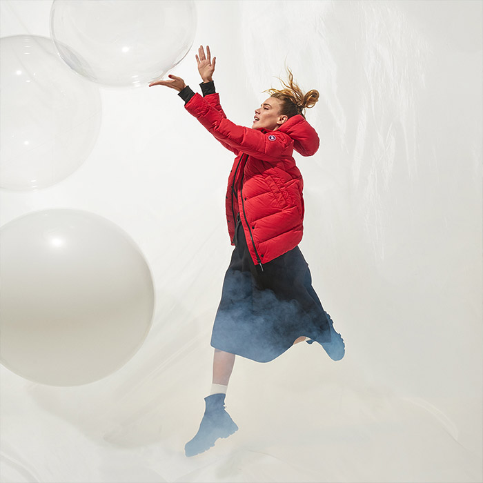
To support the opening of Canada Goose’s new stores in Milan, Shanghai and Paris, we concepted and designed an urban excursion guide to help customers experience nature within their city.
To support the opening of Canada Goose’s new stores in Milan, Shanghai and Paris, we concepted and designed an urban excursion guide to help customers experience nature within their city.
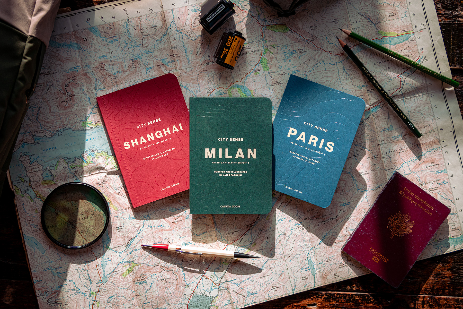
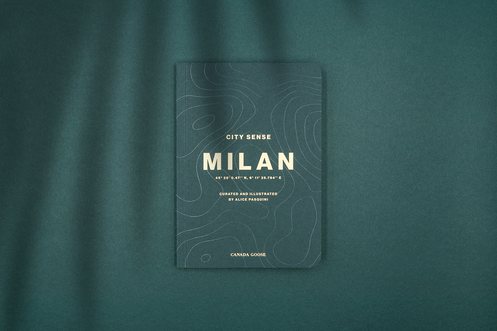
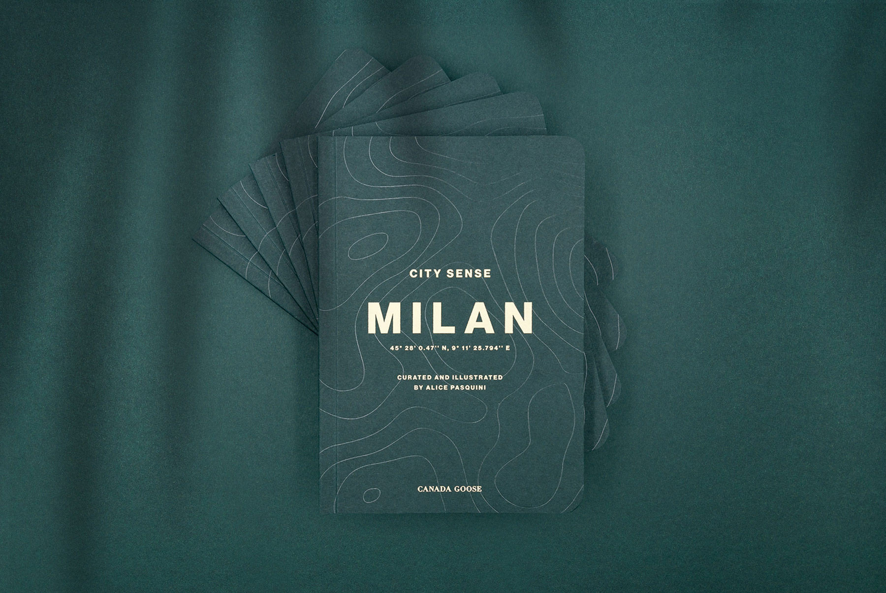
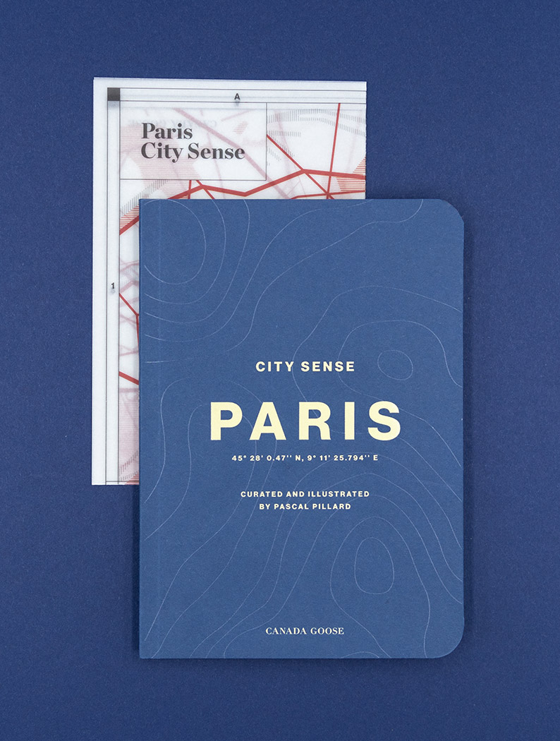
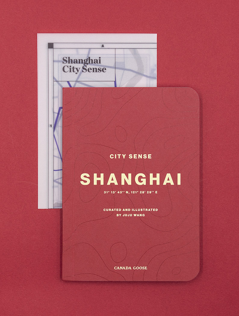
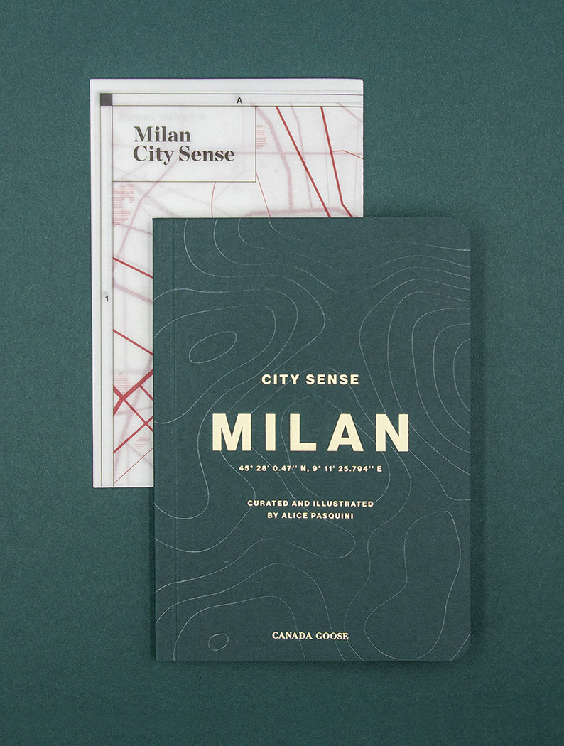
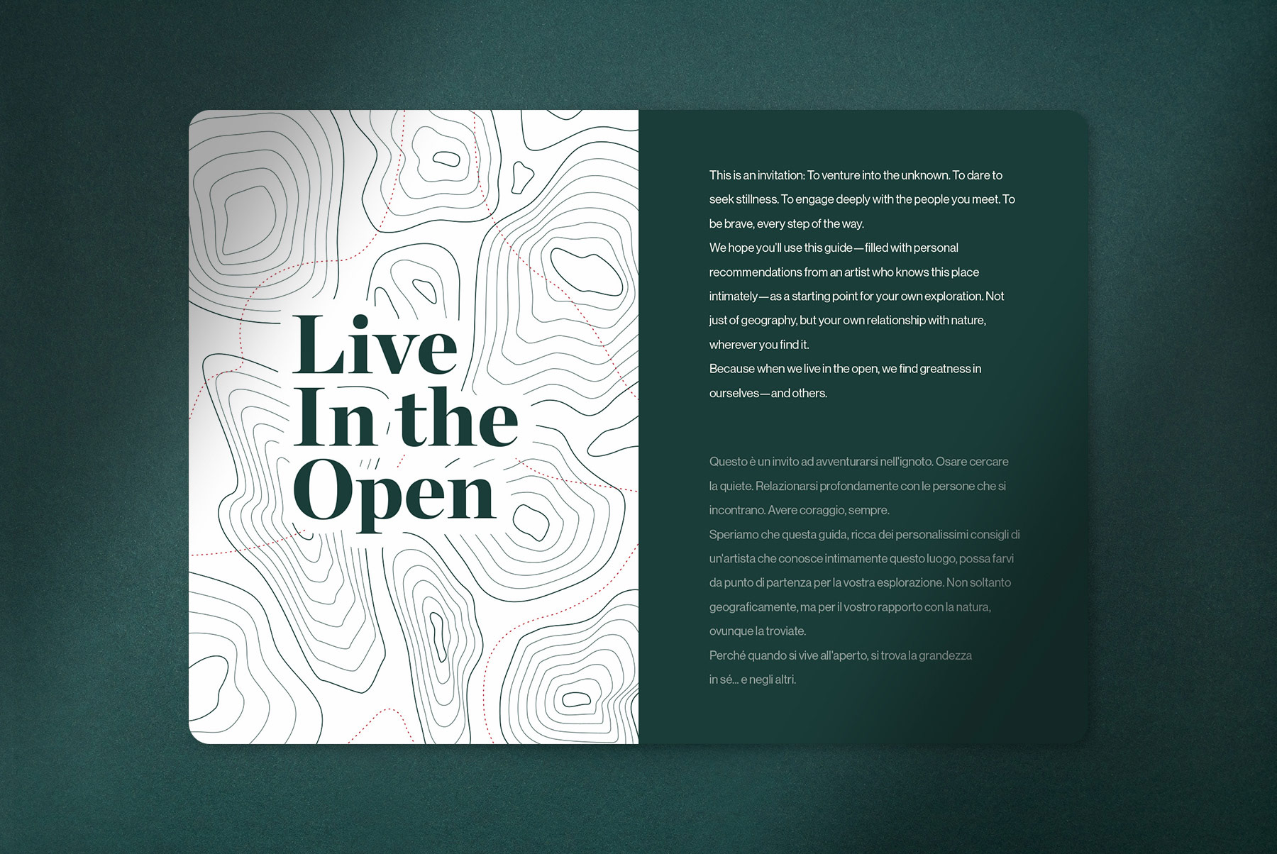
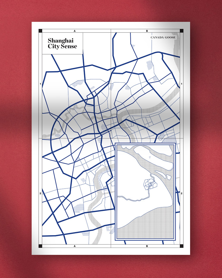
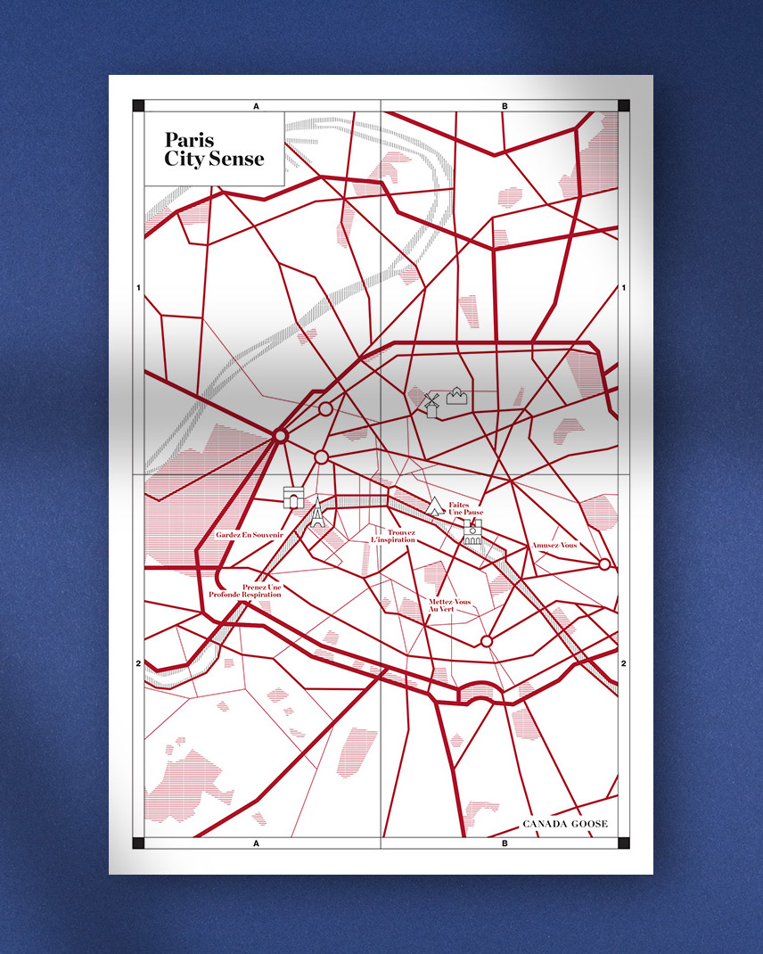
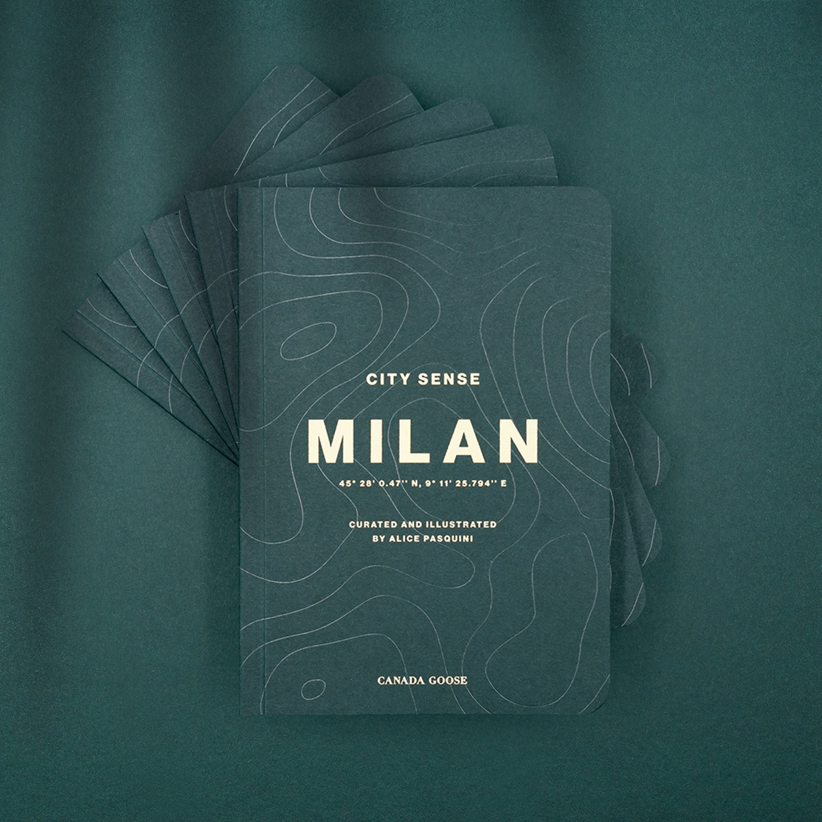
City Sense is a global series of pocket guides to help you Live in the Open, within the confines of a city.
The urban excursion guide prompts users to go on mini excursions in their city and discover 6 locations where nature can be experienced. We conceived the guide as a hybrid between a travel journal and an excursion notebook.
Each City Sense is created in collaboration with an artist that illustrates the guide and curates the 6 excursions. This makes every City Sense unique.
City Sense is a global series of pocket guides to help you Live in the Open, within the confines of a city.
The urban excursion guide prompts users to go on mini excursions in their city and discover 6 locations where nature can be experienced. We conceived the guide as a hybrid between a travel journal and an excursion notebook.
Each City Sense is created in collaboration with an artist who illustrates the guide and curates the 6 excursions which makes every City Sense unique.
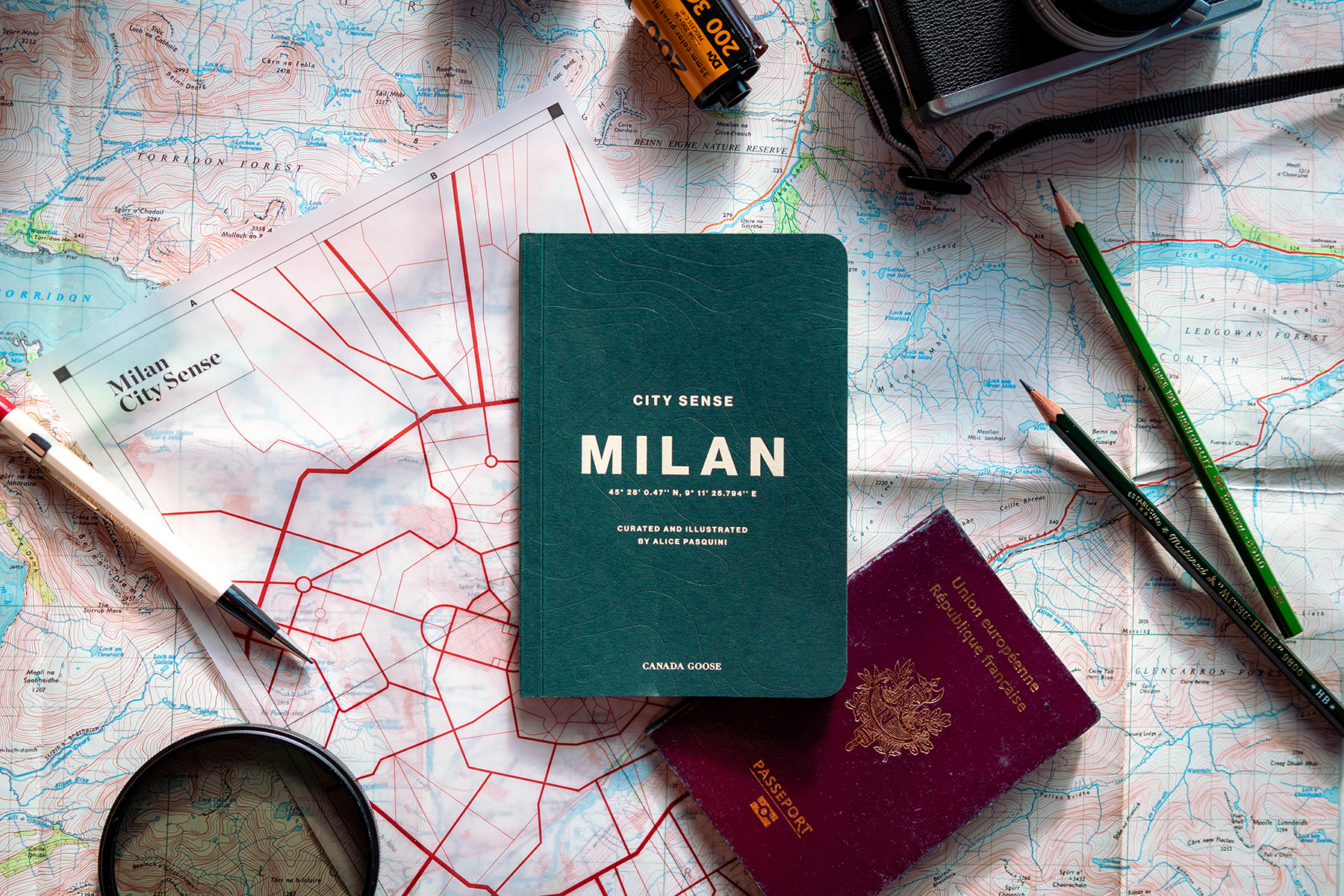
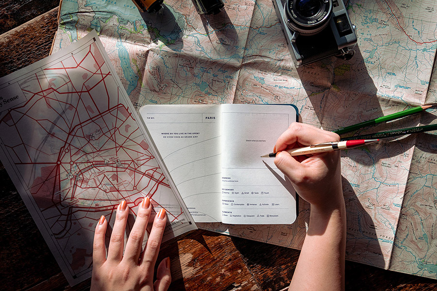
For the art direction, I took inspiration from the universe of the outdoor explorer, travel diaries, premium notebooks and field/excursion guides.
The idea as to blend all these elements and create an excursion journal. Using the graphic vocabulary found in those references: coordinates, various practical and scientific data, symbols, maps and itineraries, handwritten notes...
Topographic shapes became a key element of the design. Sticking with the excursion theme, these topographic shapes evoke a sense of exploration and functionality - two key elements of the Canada Goose brand.
For the art direction, I took inspiration in the universe of the outdoor explorer, travel diaries, premium notebooks and field/excursion guides.
The idea as to blend all these elements to create an excursion journal. Bringing the graphic vocabulary found in those references: coordinates, various practical and scientific data, symbols, maps and itineraries, handwritten notes...
Topographic shapes became a key element of the design. Sticking with the excursion theme, these topographic shapes evoke a sense of exploration and functionality - two key elements of the Canada Goose brand.
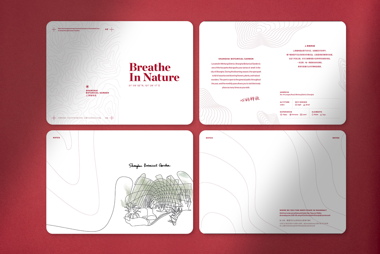
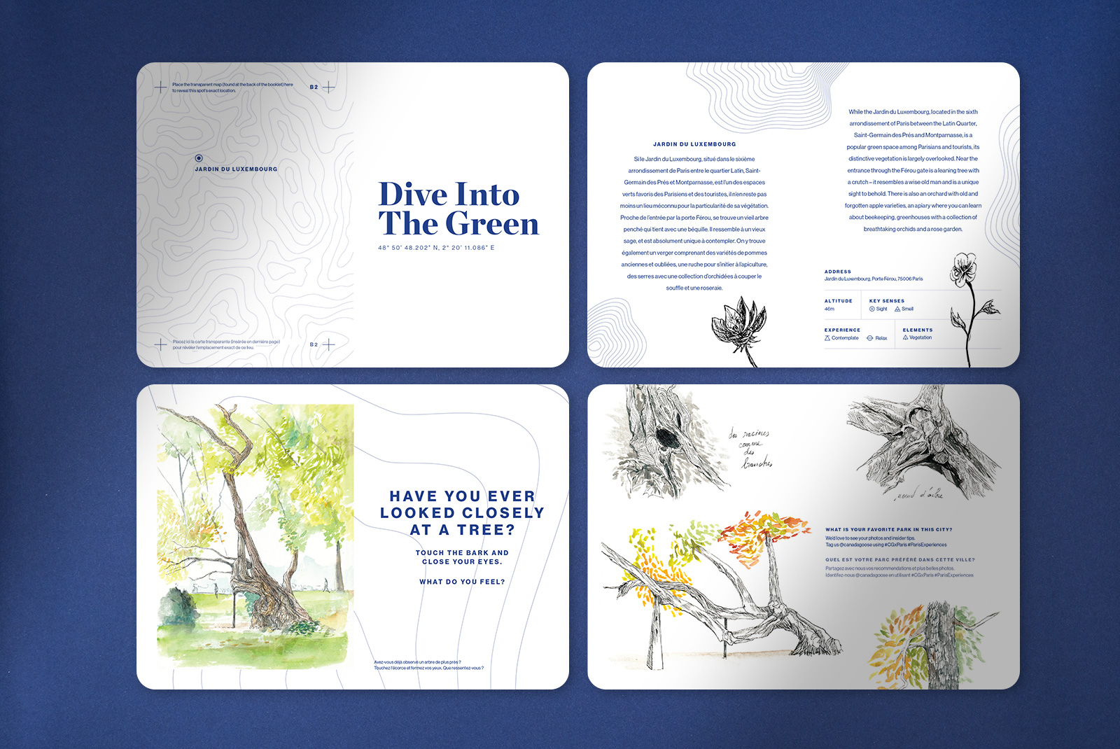
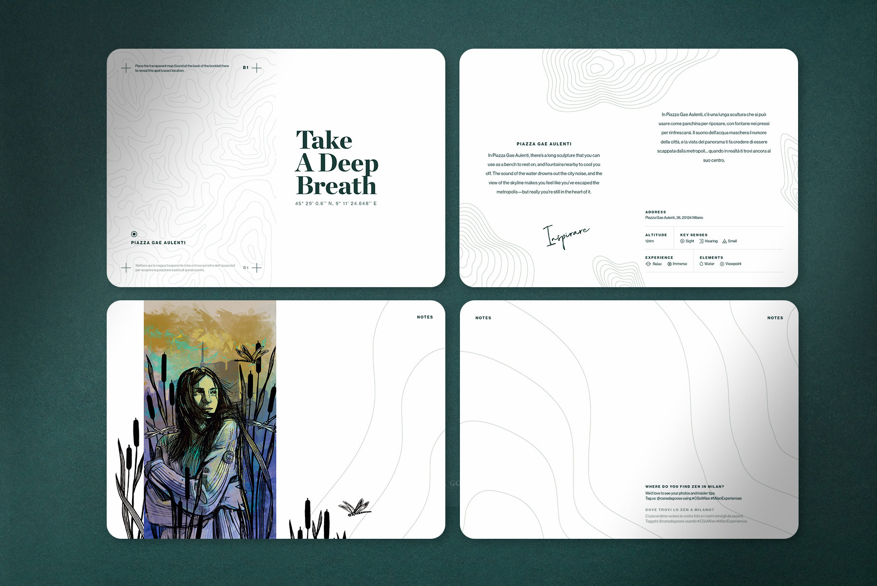
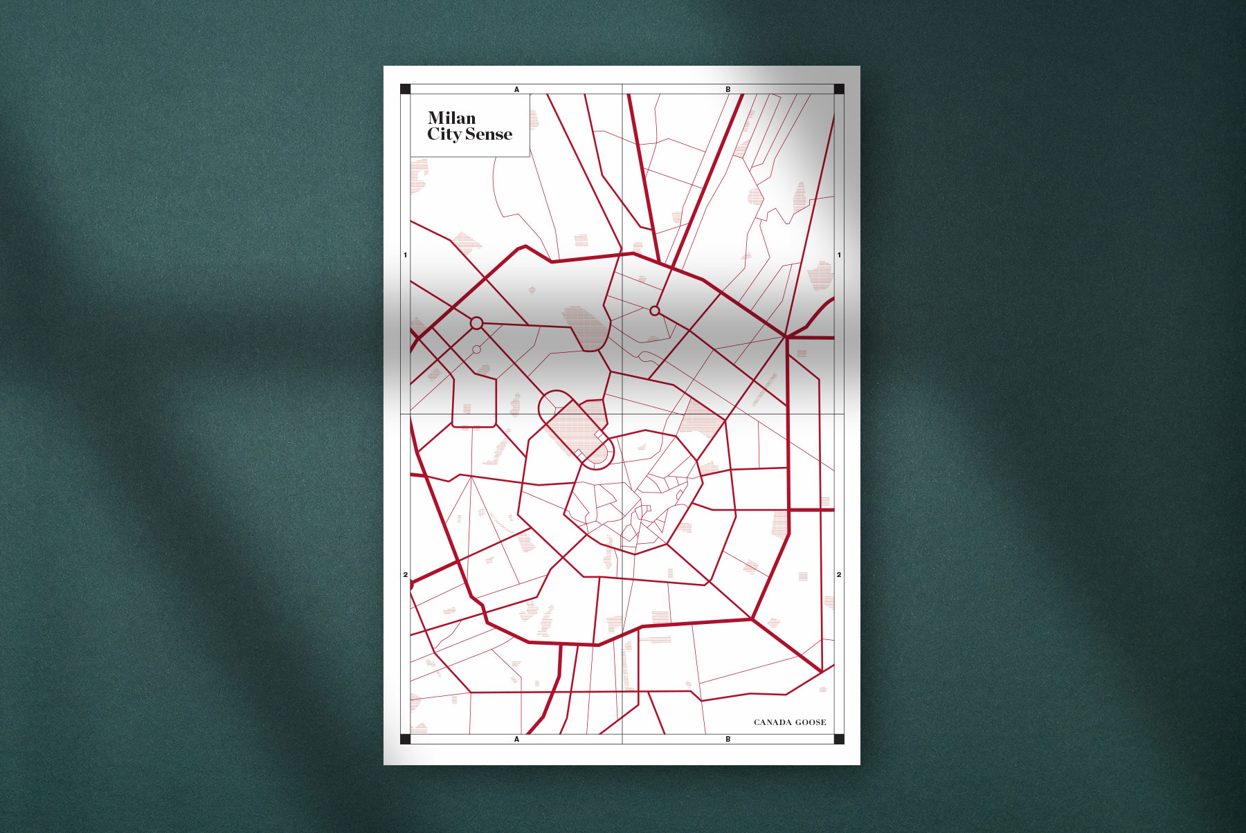
The ambition was to help people rediscover a city they thought they knew deeply. To add a sense of mystery and wonder, the City Sense comes with a transparent map that can be placed on the different chapter pages to reveal the exact location of the different recommendations.
The ambition was to help people rediscover a city they thought they knew deeply. To add a sense of mystery and wonder, the City Sense comes with a transparent map that can be placed on the different chapter pages to reveal the exact location of the different recommendations.
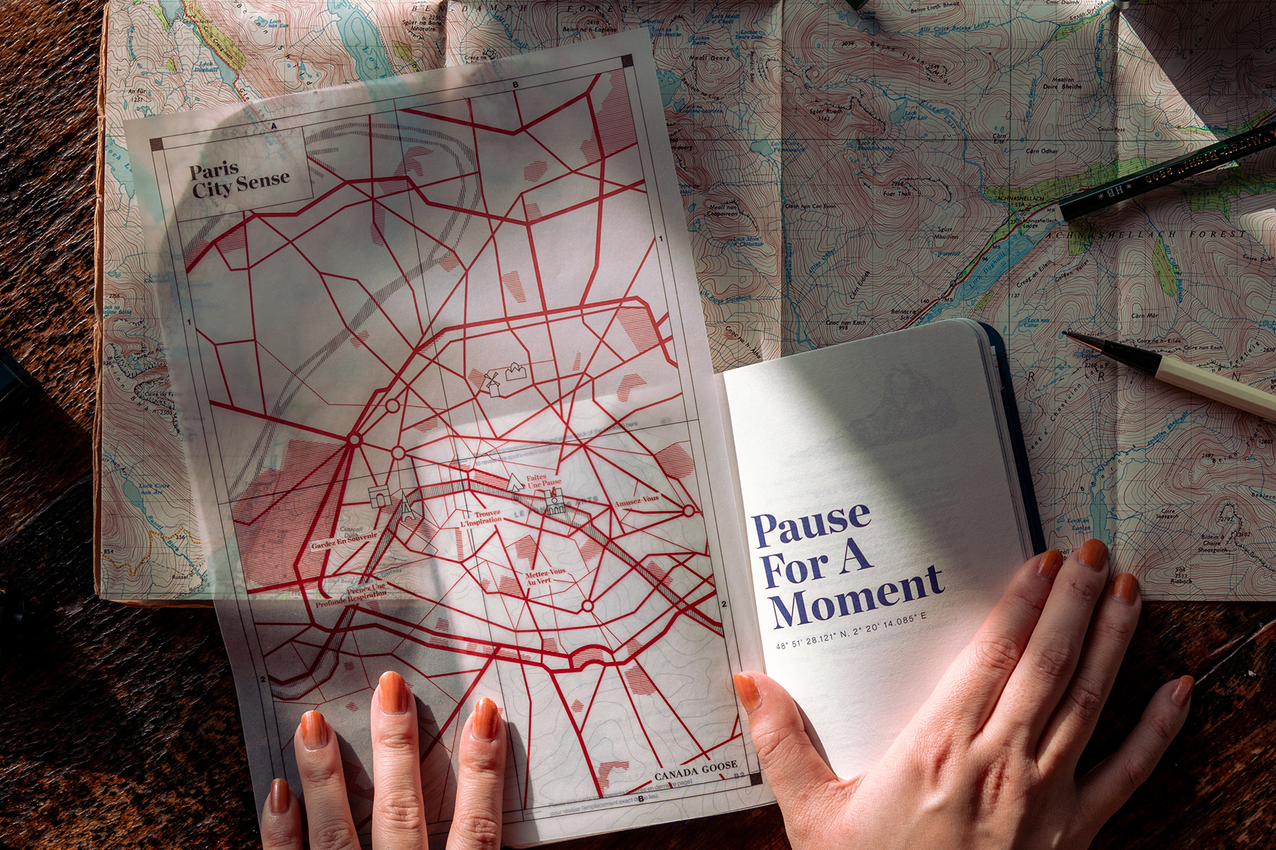
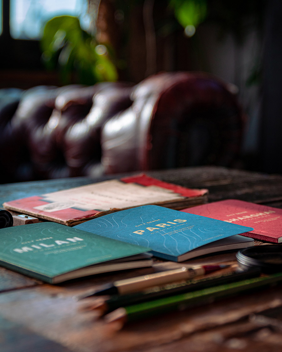
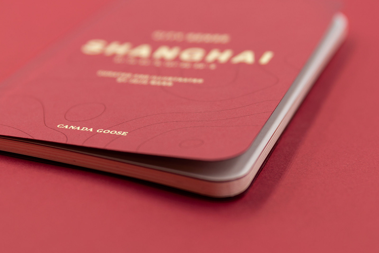
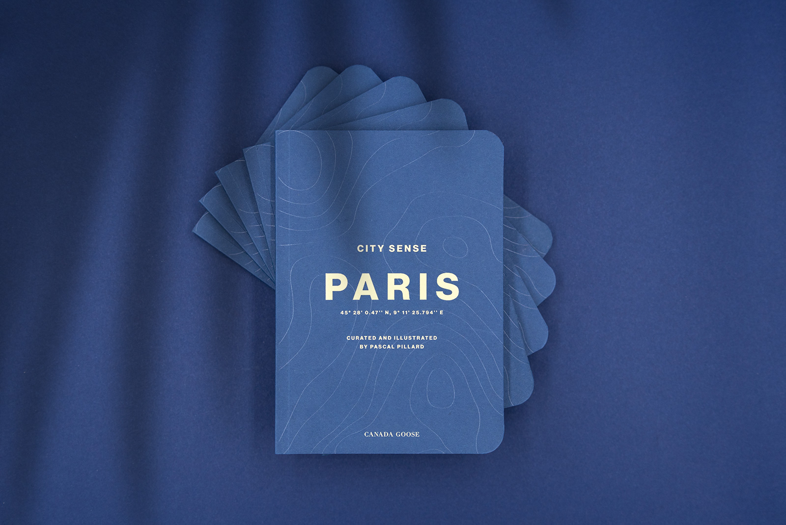
The guide had to feel premium but also light, durable and portable to bring it everywhere with you. City Sense is made in a postcard format (A6) with rounded corners to be more durable.
The cover was printed on beautiful G.F Smith Colorplan paper with a grainy and natural texture and shows off the topographic shapes in subtle transparent foil to deliver a premium finish.
Credits
Credits
Client: Canada Goose
Creative Direction + Art Direction: Mélanie Hubert
Concept: Mei Kanamoto, Mélanie Hubert
Graphic Design: Mai Takano
Producer: Fred Mouniguet
Strategy and account management: Mattijs Devroedt
Product photography: Fred Mouniguet
Content and copywriting: Canada Goose
Paris and Milan editions printing: Park Communications Ltd., London
Other projects


Yonex Golf - Ezone GTAdvertising campaign
Canada Goose - Lighweight DownSocial campaign
Diane BonheurSocial Content