Role:
Concept
Art Direction
UI Design
Agency:
monopo
Visit the website
Role: Concept, Art Direction, UI Design
Agency: monopo
Visit the website
CAS is an international non-profit founded to advance cellular agriculture, the process of creating animal products from cells rather than animals. Cellag.org is built as a truly engaging entry point for people that are new to cellular agriculture.
CAS is an international non-profit founded to advance cellular agriculture, the process of creating animal products from cells rather than animals. Cellag.org is built as a truly engaging entry point for people that are new to cellular agriculture.
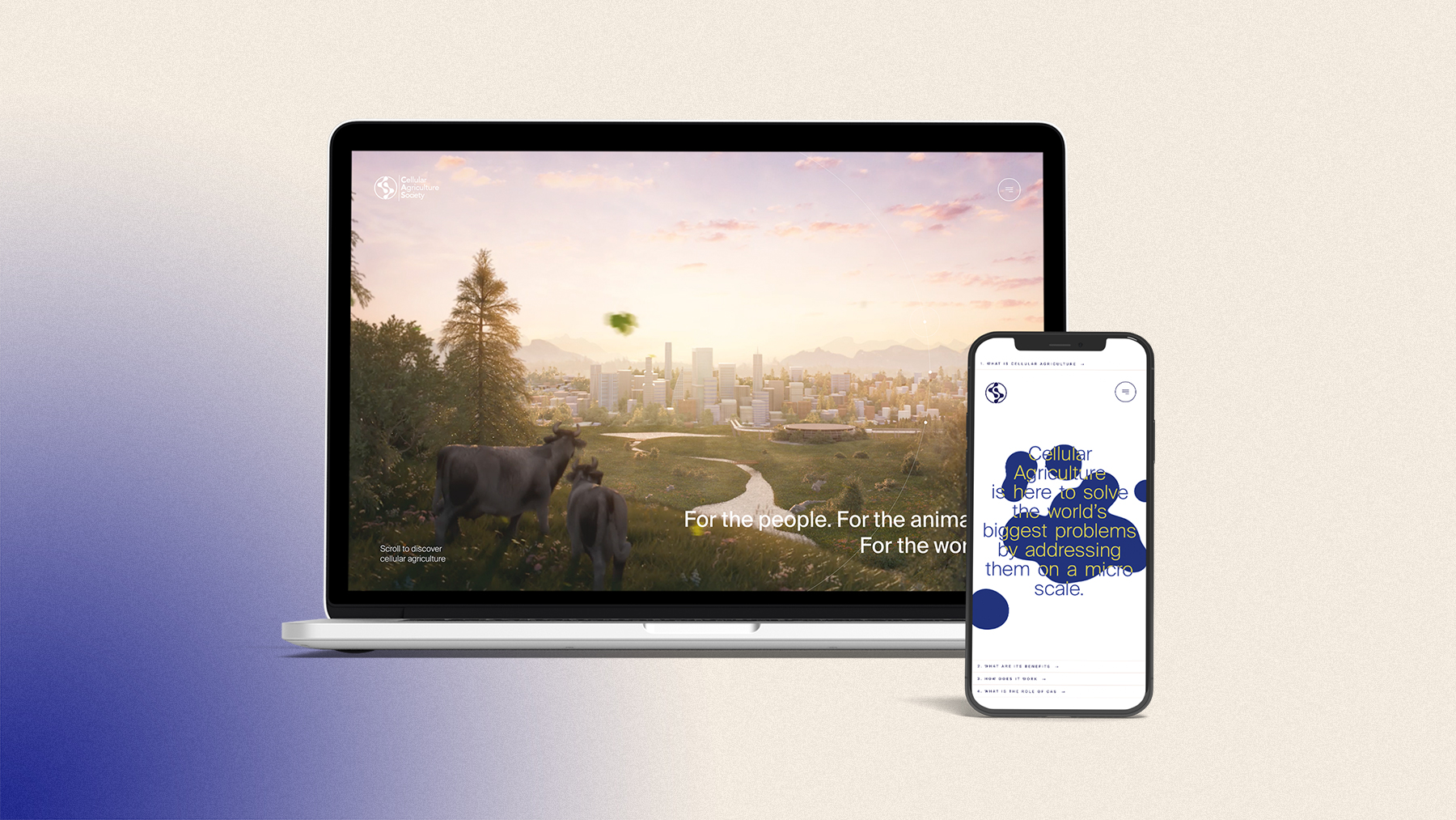
Cellular agriculture has the potential to solve a lot of the world’s biggest problems. From the environmental pressures created by factory farming to the health risks of current food mass production, cellular agriculture can move the world forward without the need for mass behaviour change.
Without much knowledge on the subject however, some people feel sceptical about the idea. It can seem too good to be true. Our challenge was to help people imagine what a future with cellular agriculture could look like and help them understand the science that makes it possible. The website had to match the level of innovation and craft of the industry it represents, while remaining simple, accessible and optimistic.
Cellular agriculture has the potential to solve a lot of the world’s biggest problems. From the environmental pressures created by factory farming to the health risks of current food mass production, cellular agriculture can move the world forward without the need for mass behaviour change.
However, without much knowledge on the subject however, some people feel sceptical about the idea. It can seem too good to be true. Our challenge was to help people imagine what a future with cellular agriculture could look like and help them understand the science that makes it possible. The website had to match the level of innovation and craft of the industry it represents, while remaining simple, accessible and optimistic.
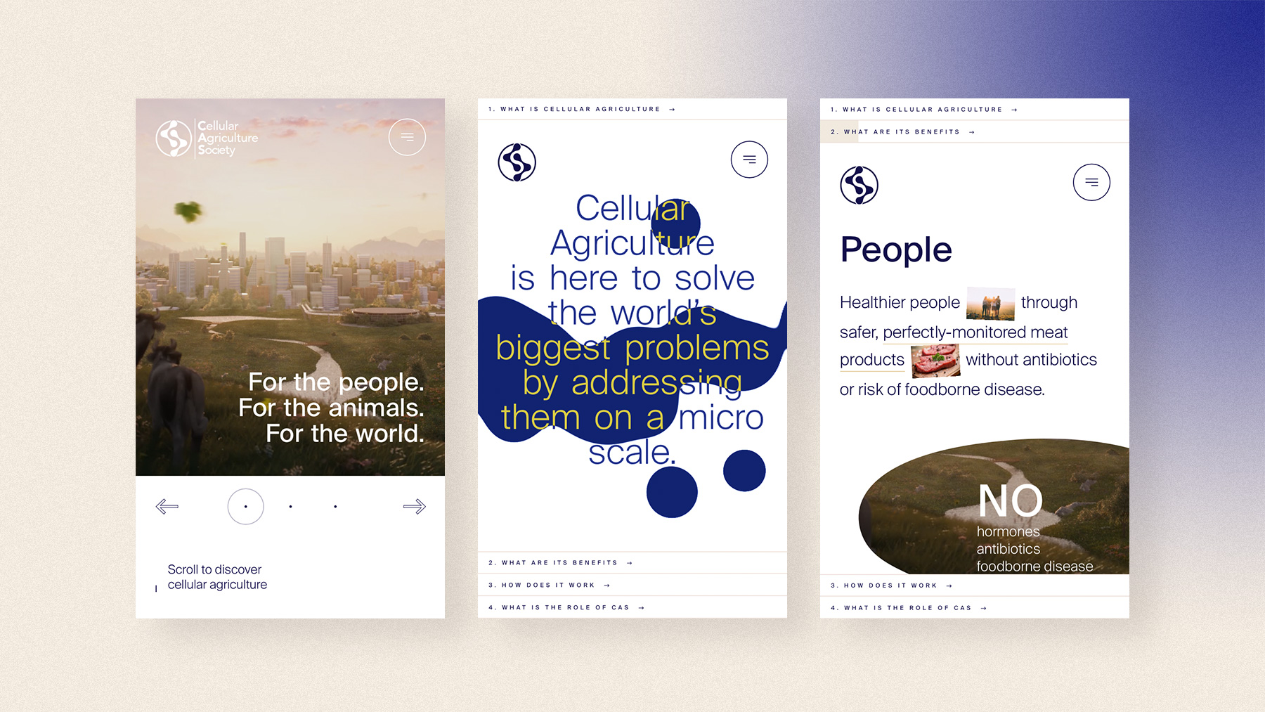
The art direction had to get the nuance right. It should feel visionary without becoming alienating. Optimistic without being naive. Powerful without looking threatening. Smart without looking artificial.
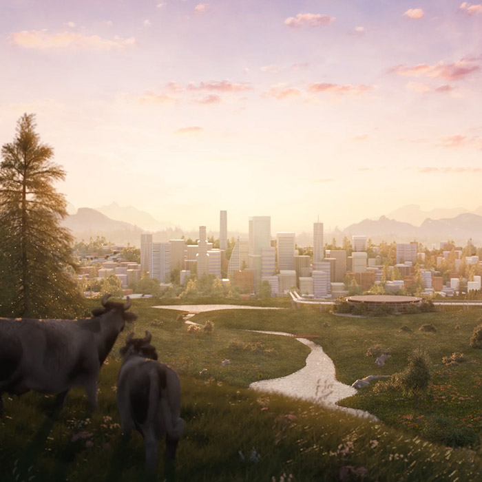
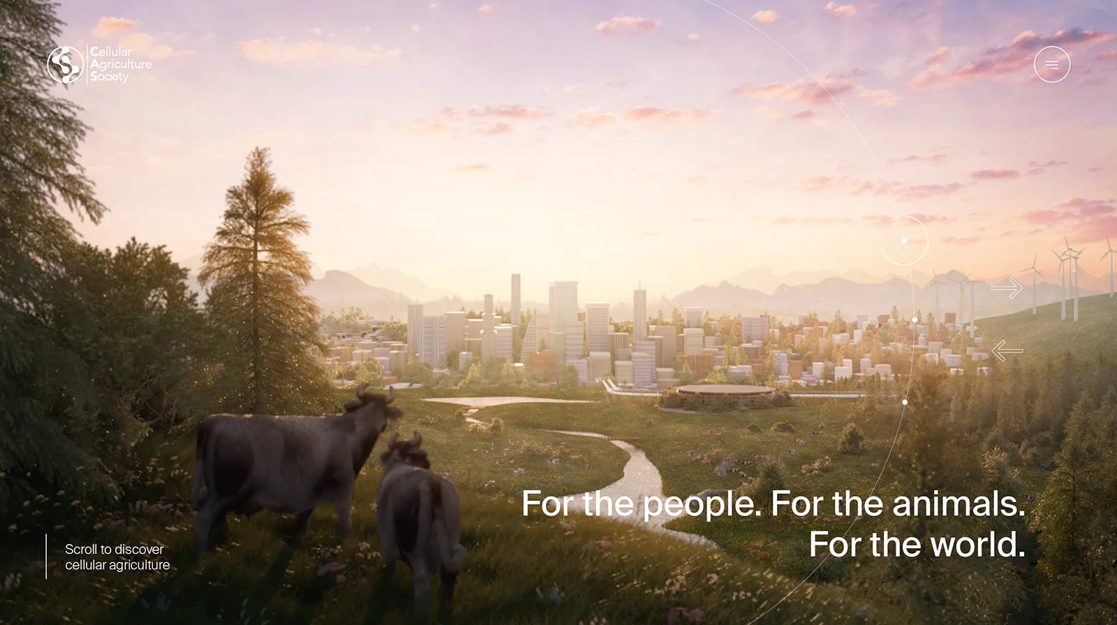
We comissioned Wove collective to create a hero animation that depicts a future where people, animals and planet live in harmony.
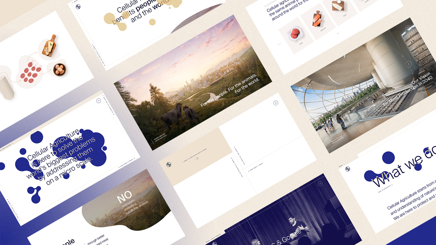
I reduced the colour palette to a combination of pure white, dark blue and several hues of gold, to reflect optimism, innovation and sophistication. The sans-serif font Suisse International adds an extra level of refinement and reassurance.
The art direction had to get the nuance right. It should feel visionary without becoming alienating. Optimistic without being naive. Powerful without looking threatening. Smart without looking artificial.
We comissioned a hero animation to Wove collective to depict a future where people, animals and planet live in harmony.
I reduced the colour palette to a combination of pure white, dark blue and several hues of gold, to reflect optimism, innovation and sophistication. The sans-serif font Suisse International adds an extra level of refinement and reassurance.
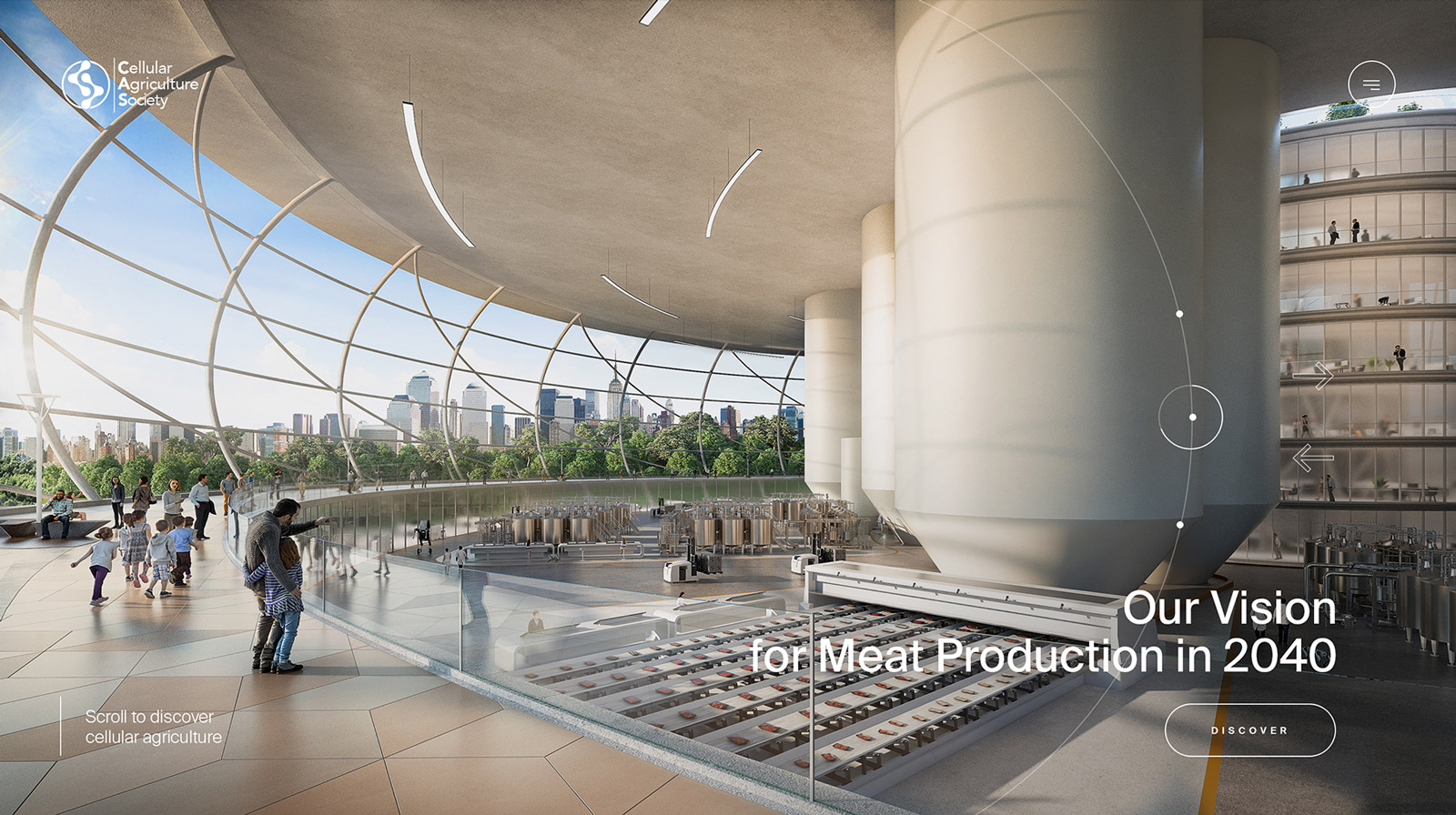
One of the hero element is definitely the abstract cell shape which we see in different guises across the website. From strong animated header to preloader to animation between page transitions. The cell shape is both organic and scientific.
We wanted people to engage with the subject of cellular agriculture and play with it. Most pages start with a webGL render of the cells that move subtly and interact with the mouse on hover.
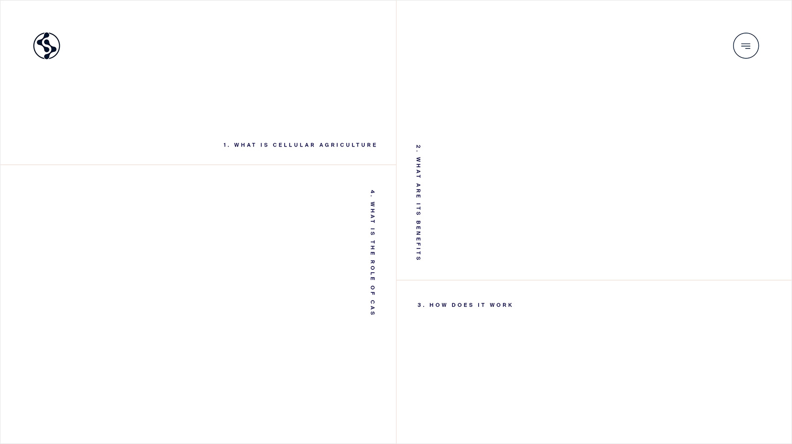
The homepage was designed to work as a one-page introduction to the subject of cellular agriculture and CAS. The perfect introduction for anybody new and interested in the subject. We didn’t want to overwhelm a new audience with an information-dump however. Instead, we created a navigation concept that tells the story of CAS in four simple chapters, capturing people’s attention and holding onto it as they go from chapter to chapter.
People can follow the linear narrative or can skip around to the chapter they are most interested in by using the navigation spread across the four edges of the screen.
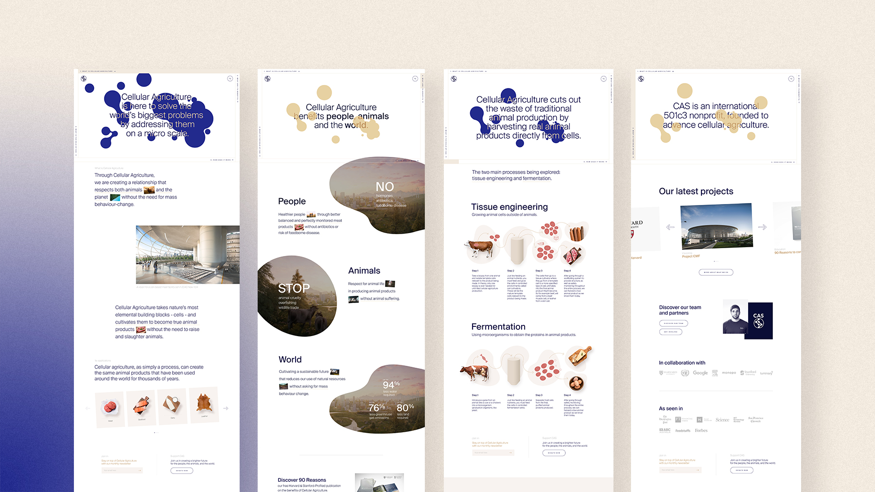
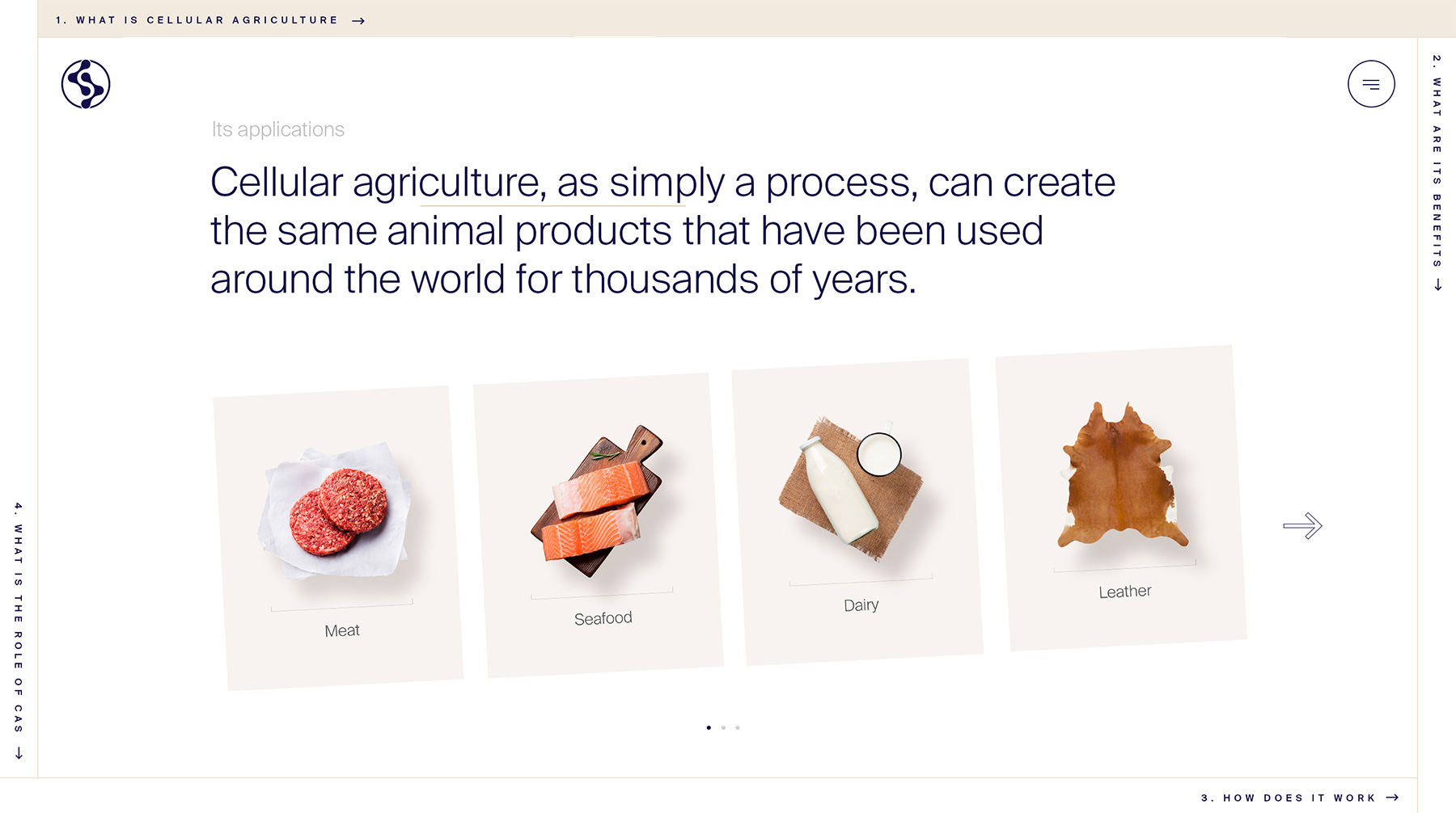
The homepage then leads on to secondary pages that go into more depth on the work CAS has done as an organisation and the team that is working behind the scenes.
The homepage then leads on to secondary pages that go into more depth on the work CAS has done as an organisation and the team that is working behind the scenes.
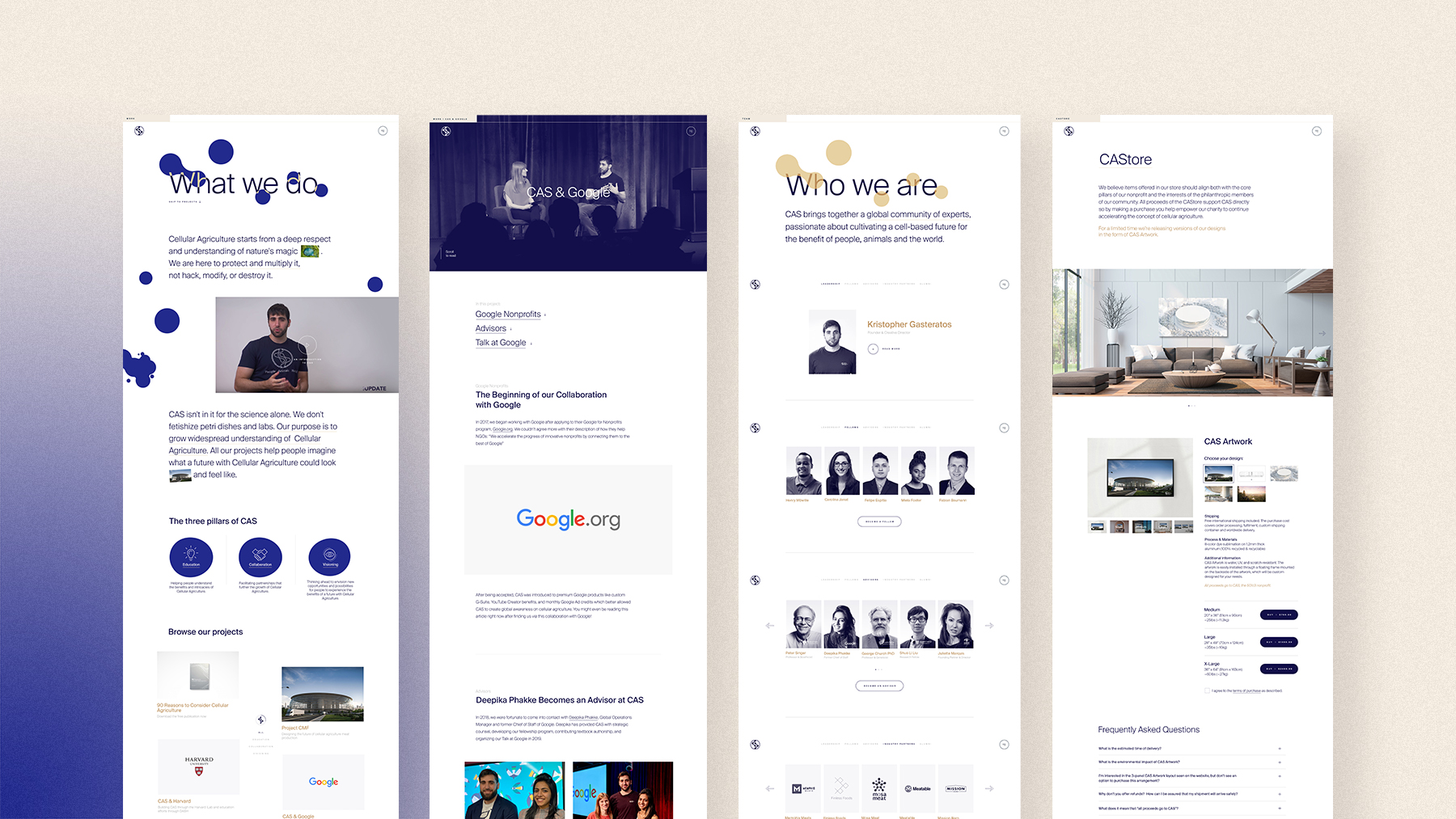
A lot of effort went into crafting the interactivity of the different elements. Every interaction had to be crafted to leave people with a positive and innovative memory of cellular agriculture such as interactive cells, pictures moving on a 3D axis on hover and menu button magnetically sticking to the pointer, cell transitions...
A lot of effort went into crafting the interactivity of the different elements. Every interaction had to be crafted to leave people with a positive and innovative memory of cellular agriculture such as interactive cells, pictures moving on a 3D axis on hover and menu button magnetically sticking to the pointer, cells transitions...
Credits
Credits
Client: CAS, Cellular Agriculture Society
Creative Direction + Art Direction: Melanie Hubert-Crozet
Graphic and web design: Melanie Hubert-Crozet, Mai Takano
Strategy, account management, copywriting: Mattijs Devroedt
Front-end development: Ryo Miyakawa, Taisei Dofuku
Back-end development: Kenta Takahashi
Producer: Kenta Takahashi, Fred Mouniguet
Technical Direction: Kenta Takahashi, Shun Okada
Hero visual animation: WOVE collective
Other projects
Yonex Golf - Ezone GTAdvertising campaign
Canada Goose - Lighweight DownSocial campaign

Diane BonheurSocial Content
